User story mapping is relatively simple: you’re talking about a user’s experience with your product in a format that explains their journey like a story. The concept was invented by Jeff Patton because he noticed that oftentimes people would get lost in arguments about a product’s features, and the actual user experience would get put on the back burner.
But ultimately the way a user experiences a product is what determines whether or not they purchase and use it, and so in reality the user experience should be one of the TOP priorities when creating a new product. According to Jeff, story mapping “will help you build a better backlog that [in turn] will help you more effectively explain your system, prioritize, and plan your releases.” It helps you focus on the big picture so that you don’t get lost in the individual elements.

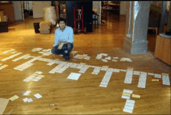
Image 1: Story-mapping in action
It’s exactly what it sounds like- a map. It consists of two independent dimensions; user activities and implementation. Typically you would arrange the user activities along the horizontal axis in order of their priority, and you would use the vertical axis to show the increasing sophistication of the implementation of said activities.
If you follow this model, the first row of your map will be an extremely simplistic version of your product, ie: everything you need for it to run, but no bells and whistles. As you add more rows, you’re essentially adding more product features (while still focusing on the user experience). It might sound complicated, but in practice, it’s really not.
Jeff shared the picture on the left of his friend Gary creating a story map for his product “MIMI”, otherwise known as Music Industry Marketing Interface.
While he was working on the map, Gary realized that his original idea was a bit more complex than he originally thought. He was able to use the map to tone down his project and focus on one specific part; building a piece of commercial software to send out mailers quickly and easily.
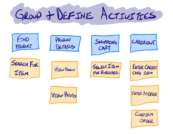
Agile Velocity has a somewhat more simplistic version of story mapping on their website:

Image 2: Story mapping design
If you look at the top row in blue, you’ll see that it’s the most basic version of their website. It consists of the most simple version of the user activities. The yellow boxes listed vertically show the user experience broken down into more specific steps. For example, when you make a purchase you don’t just “check out” (but wouldn’t that be nice?) you have to follow specific steps, such as entering your payment information and shipping address.
By creating a map, you’re forced to look at each individual element and evaluate its effectiveness. Without the map, you may have been tempted to rush through the checkout stage without realizing that perhaps your template for contact info isn’t formatted correctly. This is something that could easily annoy a user enough to cause them to leave your site without making a purchase.
Not interested in making a physical story map? Check out this article by Feed Otter on seven story mapping programs you can find online!
Story mapping should always be a TEAM effort; it should never be left up to one person to complete. In the above example about Gary and MIMI, it was also mentioned on the website that Jeff Patton was also helping Gary create his map, as well as another contributor called Dave Hoover AND an entire team of people from Obtiva.
So who should be in the room when you create your map? First and foremost, users! Who better to describe the user experience than people who are actually using the product? It’s also a good idea to include the product manager, someone who is specifically in charge of user experience and design, SME’s, and someone in charge of engineering. The more people you have working together on your team, the better your map will be.
In addition, it’s always a good idea to color-code your map to make it easy to read and understand (and then don’t forget to make a key so others understand your system (again, it’s about working on a team!)). Work one step and one layer at a time, and know that each step does NOT require an action (don’t make it harder than it needs to be).
Finally, don’t forget to continually update your map. It’s ok to present an early version of it to your stakeholders, but then don’t just throw it in the corner! Add and revise as you go along, and then share your progress! It’s a great way to make your progress visible (and have proof that you’ve been working!) so that you’re not just telling people what you’ve been up to.
If you’d like more detailed information on how to incorporate story mapping into your business, check out Jeff Patton’s website. He’s written a book, numerous articles, and blog posts, put together a slideshow and a presentation, and if that’s not enough he also lists more resources on his site. Good luck and happy mapping!
Image 1: jpattonassociates.com
Image 2: agilevelocity.com
