
There’s more to building a website, publishing good content, and encouraging people to sign up for your email list when you want to be successful. And, while what you’re doing right now may be working, and even generating you sales in your online shop, there’s always room for improvement—and we’ve got the web design tips to help you do just that.
Many marketers put all their focus on things like SEO, lead magnets, and building a strong social media presence. But while these things can help drive traffic to your website, if the design of your site is all wrong, you won’t see nearly as many conversions as you would like.
A high-converting website is the ultimate key to your success.
That’s why today we’re sharing with you some of the top web design tips you should follow when creating your website, so your traffic remains high and your conversion rates follow.
4 Web Design Tips that Will Boost Your Conversion Rates
Web Design Tip #1: Have a Clear Value Proposition
People want to know immediately what your site is all about once they land on it. Even if they willingly click on your site from a search result, and have a good idea of what you have to offer them, they want to be reassured once they get there.
Since competition in the eCommerce world is so tough, you need to come up with a strong value proposition that people can relate to when they visit your site.
For example, Uber does a great job of using a catchy value proposition (Get there – Your day belongs to you) that lets potential customers know they mean business when it comes to their services.
In one quick phrase, you know what Uber is about and what they offer you. Your value proposition should be your brand’s selling point, so make it count.
Need help creating the perfect value proposition?
Check out CoSchedule’s Headline Analyzer. All you have to do is enter your headline, get a score, and make improvements.
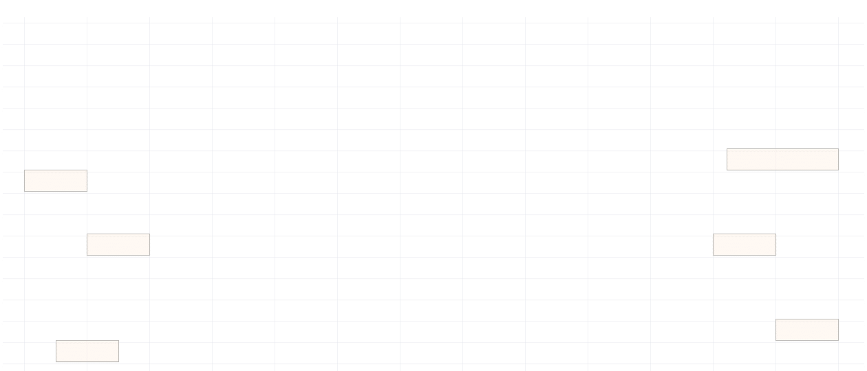
Web Design Tip #2: Follow the Rule of Thirds
Many marketers will tell you that this well-known design trick photographers use works well for websites as well.
In short, the Rule of Thirds claims that you should break your image into thirds so that you have 9 equal parts. In the grid that you’ve now formed, you should focus your site’s main points of interest at the intersections created in the middle of the image.
This is where people will focus most of their attention. That means those intersections are the best places to grab your site visitors’ attention and get them to convert.
Take for instance Rockstroh Drums’ homepage. Their value proposition is nearby two of the intersections, their call to action lays directly on the line leading to an intersection, and the image that brands their company (along with the company name) sits perfectly on another one of the main intersections.
In addition to following the rule of thirds, be mindful of the natural F-pattern people follow when on websites. This is where people tend to look for the most information, so giving it to them easily will help guide them to your call to action and through the rest of your website.
Hotjar is a great tool for heat mapping how your site visitors navigate your site, so you can put the most prominent information in the line of fire so they definitely see what you have to offer.
Web Design Tip #3: Pay Attention to Color Schemes
It’s natural to want to brand your company as completely unique to everyone else out there vying for your same target audience. And, one of the best ways to do this is to utilize the power of different color schemes.
That said, there’s been a lot of research done on the psychology of color and how specific color schemes can encourage people to take action, which is what you want to happen on your website.
In fact, it has been suggested that certain color schemes improve:
- Readability
- Site comprehension
- Learning ability
- And of course, conversions
When making your calls to action buttons stand out on your website, remember to use only one color so as to not confuse site visitors, keep the color scheme (whatever you choose to use) consistent, and maintain plenty of whitespace so you don’t overwhelm people’s senses and cause them to abandon your website.
Web Design Tip #4: Grab People’s Attention
Just because someone has landed on your website with a little bit of interest in what you have to offer doesn’t mean they are fully engaged. It’s your job to continue to impress people once they get to your site and convince them that you have what they need.
To do this, consider the following best practices:
- Use eye-catching imagery that represents your brand, products, or services (keep images big and bold)
- Make all calls to action buttons large and clear, with copy telling people exactly what to do
- Incorporate multimedia including text, animation, video content, and audio
- Use hover effects so people can tell the difference between plain text and links
- Use power words to trigger excitement, a sense of urgency, and interest
Lastly, use exit popups, such as the ones you can create using OptinMonster to re-engage those who have lost interest and are about to leave your site.
For instance, The Accelerator does a good job of trying to get people to subscribe as they exit their website:
After all, these give site visitors one last chance to convert, even if they were on the way out.
Another great tool for gaining more conversions is the Hello Bar. It’s free to use, doesn’t take up a lot of retail space, and gives people ample chance to sign up if they want to.
Final Thoughts
And there you have it! Four of the best web design tips that will help drive traffic, boost conversions, and net you more sales than ever before.
Remember, SEO, lead magnets, email marketing campaigns, social media, and killer content are all essential to scaling your business and becoming successful. But if people come to your website and don’t like what they see, your chances of reaching your full potential will fall short – every single time.
And when you realize you’re starting to get more conversions than you know what to do with, make sure to check out Feedotter so you can automate RSS-based emails and create beautiful email newsletters with ease to accommodate your growing audience.